2013 Cathedral Inspiration House
Thursday night I was invited to the Press party for the 2013 Inspiration House where I had the opportunity to meet the designers and take a peek at the rooms. I was invited as press for The Cow Spot Blog which was cool in and of itself. I really enjoyed my time and loved speaking with the designers about their vision while touring their respective rooms.
I've been to a lot of show houses, but this one was special. I'm attributing the warm and fuzzy feeling this house gave me to the designers. Like so many show houses, each room was furnished and designed by a different designer or design firm. Most were uber enthusiastic,and eager to talk about their spaces - the decorative concepts, decorative items and the overall vision. Many had cool stories to share about certain items in the space and a few told me they did some of the painting and final touches themselves to ensure everything turned out just right.
Here are a few snippets I took on Thursday to tide you over until you can see this beautiful house in person.
This room is filled with personality. Most items in this space came with a story including the dramatic chandeliers.
The chandeliers were actually existing elements in the space. The designers jazzed them up with Hollywood bulbs and draped them in crystals creating fabulous statement pieces.
I loved the resourcefulness the designers brought to this space, for example the curtains shown above we're from Ikea and the chains were from Home Depot and painted.
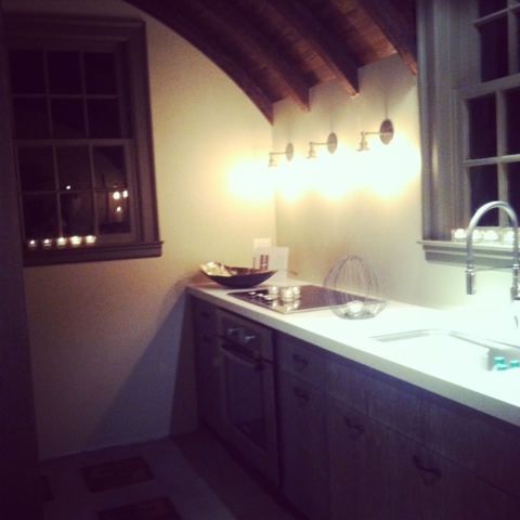
This is the downstairs Kitchen. It's a small space that was completely transformed with the addition of the barreled ceiling beams. The cabinets add an additional layer of interest to the space in addition to the cool floor detail.
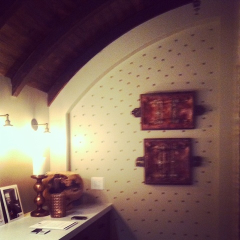
Here's another shot of the kitchen. How cool are the nail heads on the wall?
This was a really fun room and one of the the first I toured upon entering the house. This space is the gentleman's study and was filled with taxidermy. There was a giraffe, a bear (seen above) and a monkey to name a few. The designer explained she didn't want to do your typical gentleman's study and instead wanted to create a hunting lodge feel. The walls were painted and stenciled by the designer herself, she even added her logo in the center of each stencil. This designer was full of enthusiasm and layered the space with interest.
Let's go upstairs.....
Put your sunglasses on - this staircase was bright! I've never seen a staircase like this. It was funky and bright and made you want to continue up the stairs to see more.
This happy room was in the upstairs apartment. It was so chic and eclectic with a funky vibe. The designer said the wallpaper was the first element chosen and everything else came together around it.
I hope you enjoyed your sneak peek at some of the rooms. This show house truly has a layer of detail and consideration that made me run, not walk, home to start writing this post. I hope you will find time to check it out, you are sure to be inspired!
Details:
Sunday, January 27th (yesterday - sorry!)
Thursday, January 31st
Friday, February 1st
Saturday, February 2nd
Sunday, February 3rd
Thursday, February 7th
Friday, February 8th
Saturday, February 9th
Sunday, February 10th
11:00 A.M. - 5 P.M. All days.
The beneficiary of this years event is - Refugee Family Services.
For info check out the 2013 Inspiration House website here.
All photos are my own.
I've been to a lot of show houses, but this one was special. I'm attributing the warm and fuzzy feeling this house gave me to the designers. Like so many show houses, each room was furnished and designed by a different designer or design firm. Most were uber enthusiastic,and eager to talk about their spaces - the decorative concepts, decorative items and the overall vision. Many had cool stories to share about certain items in the space and a few told me they did some of the painting and final touches themselves to ensure everything turned out just right.
Here are a few snippets I took on Thursday to tide you over until you can see this beautiful house in person.
 |
| Boardroom Designed by Jennifer Reiner & Robert White of Reiner/White Design Studio. |
 |
| Boardroom Designed by Jennifer Reiner & Robert White of Reiner/White Design Studio. |
 |
| Boardroom Designed by Jennifer Reiner & Robert White of Reiner/White Design Studio. |
 |
| Kitchen Designed by Eric & Jenny Rothman and WarnerMcConaughey of HammerSmith. |
 |
| Kitchen Designed by Eric & Jenny Rothman and Warner McConaughey of HammerSmith. |
 |
| Library Designed by Summer Loftin of Summer Loftin Antiques. |
Let's go upstairs.....
 |
| Apartment Entry & Stairs Designed by Dayka Robinson of Dayka Robinson Designs. |
 |
| Apartment Living Room. Designed by: Bryan A. Kirkland of Bryan Alan Kirkland Designs. |
I hope you enjoyed your sneak peek at some of the rooms. This show house truly has a layer of detail and consideration that made me run, not walk, home to start writing this post. I hope you will find time to check it out, you are sure to be inspired!
Details:
Sunday, January 27th (yesterday - sorry!)
Thursday, January 31st
Friday, February 1st
Saturday, February 2nd
Sunday, February 3rd
Thursday, February 7th
Friday, February 8th
Saturday, February 9th
Sunday, February 10th
11:00 A.M. - 5 P.M. All days.
The beneficiary of this years event is - Refugee Family Services.
For info check out the 2013 Inspiration House website here.
All photos are my own.
