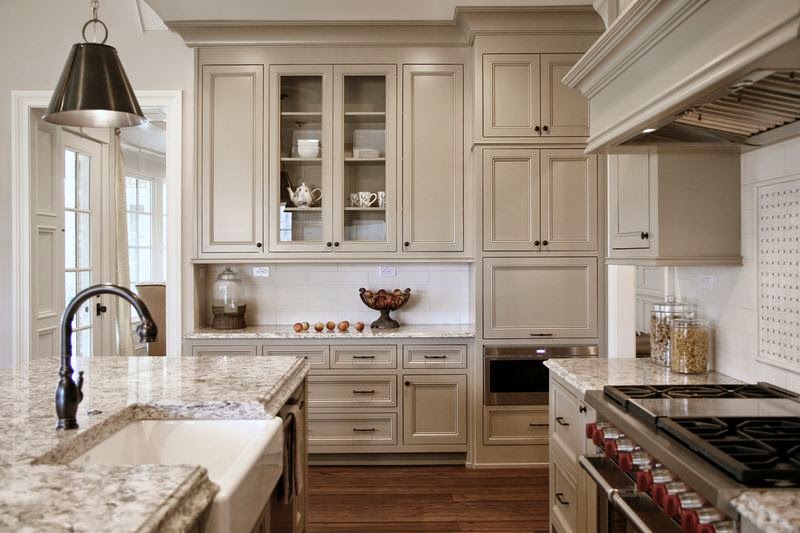
Top Taupes
Taupe is the Pharrell Williams of paint colors. It's hot on the charts right now and oh, so happy!
When I think of taupe, I think of the color that is formed when coffee is mixed with milk.
 |
| Photo from Google. |
 |
| Photo by Barbara Brown Architectural Photography. |
 |
| Photo by Barbara Brown Architectural Photography. |
 |
| Photo by Jen Wunderlich Photography. |
Out of all the taupe's I've played around with, this one is probably my favorite. Smokey Taupe is just a really good color. I've used it numerous times including the wet bar pictured above, which was part of my
#Northcliff Kitchen, and I've never been disappointed. I call this color a whisper, because it's just so elegant and soft.
Colors are always fun to explore and I've really been digging the way our taupe selections have turned out. There are some others I've come across that I haven't tried yet like Sherwin William's Balanced Beige which looks like it might be nice. What about you guys, any favorite taupes to pass along? I'd love to add to my list!
 |
| Photo by Jen Wunderlich Photography. |
Here it is again at one of my more recent kitchen remodel's -
Bridgett Court. I love how this color instantly becomes so much more present when used next to white. It just pops. There are slightly red undertones in Smokey Taupe so depending on the light it can have a very light pink hue which you can see a little bit if you compare the base cabinets in the photo above with the wet bar shot. However, it's never overpowering thanks to the also present light brown undertones.
Colors are always fun to explore and I've really been digging the way our taupe selections have turned out. There are some others I've come across that I haven't tried yet like Sherwin William's Balanced Beige which looks like it might be nice. What about you guys, any favorite taupes to pass along? I'd love to add to my list!
Unless otherwise noted all photos are my own.
